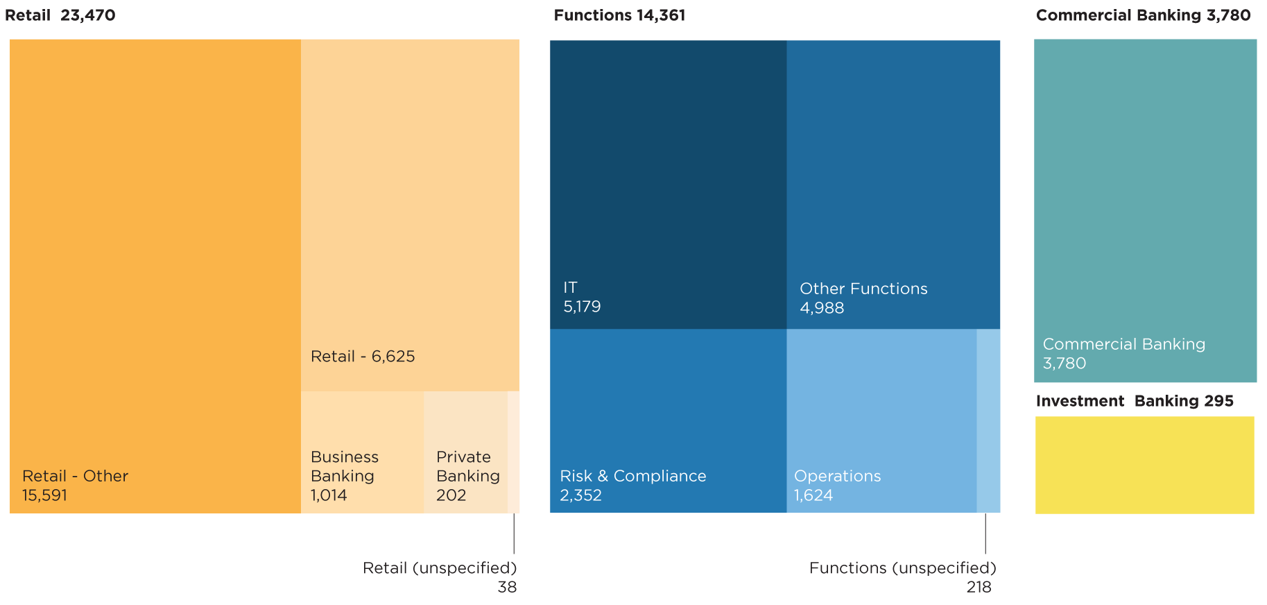
employees sent the Survey
responses received
firms surveyed
2022 Rank | Rank change from 2021 | Word | % of respondents |
1 | +1 | supportive | 9.7% |
2 | +4 | inclusive | 8.3% |
3 | -2 | customer | 7.9% |
4 | -1 | ethical | 6.3% |
5 | -1 | caring | 6.2% |
6 | +6 | large | 6.1% |
7 | +1 | focused | 5.5% |
8 | +1 | bureaucratic | 5.5% |
9 | -4 | flexible | 5.1% |
10 | = | fair | 5.1% |
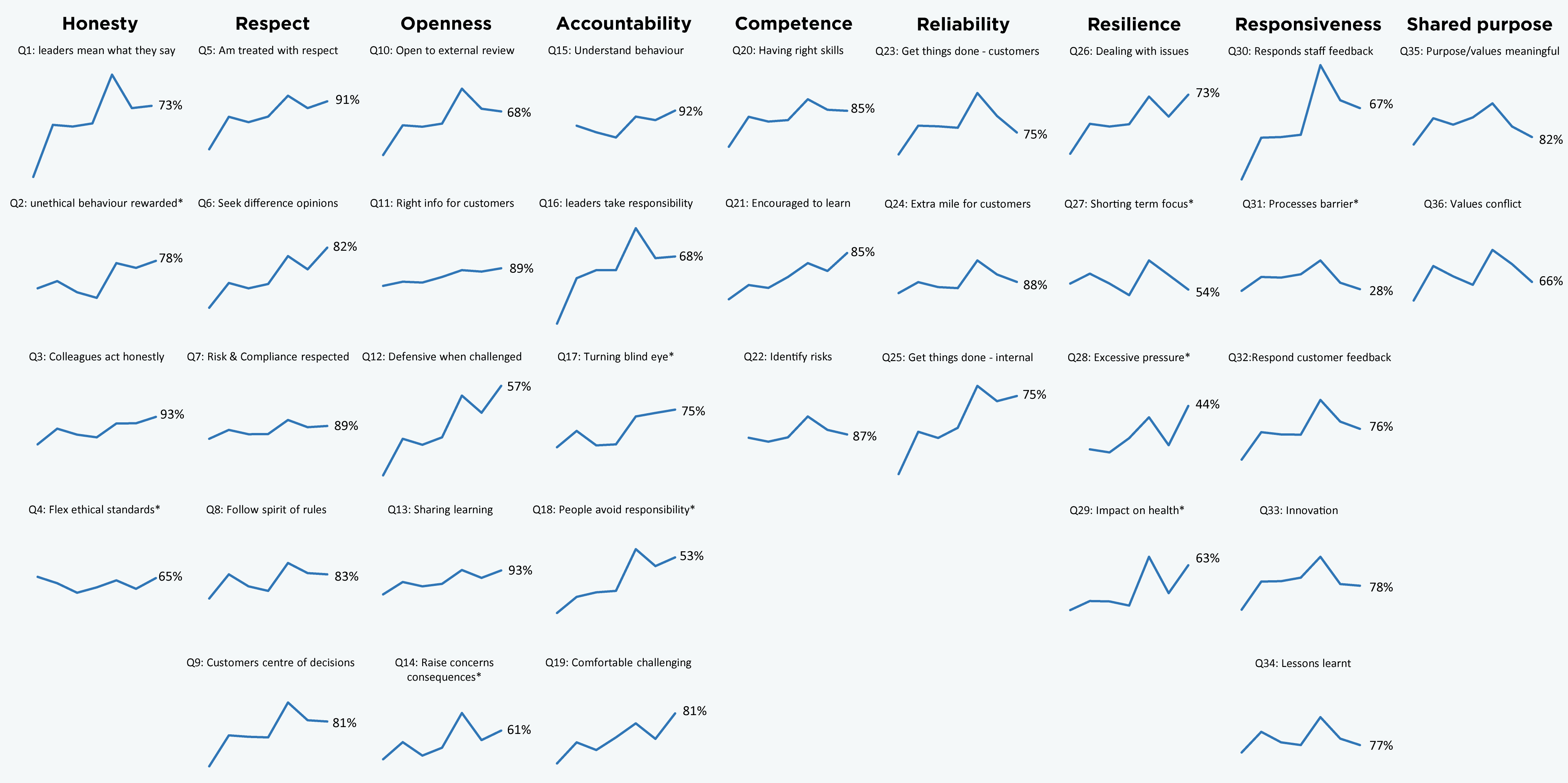
*Note: Q2, Q4, Q14, Q17, Q18, Q27, Q28, Q29 and Q31 are negatively phrased statements. For these questions, the charts show the proportion of respondents disagreeing with the statement as this indicates a more favourable response. For all charts therefore, an upward sloping line from left to right indicates an improvement in the proportion of positive responses received to the FSCB Survey over time.
Interpreting these charts: Each chart tracks the percentage of favourable responses (i.e. overall agreement for positively phrased questions, disagreement for negatively phrased questions) for one of the 36 core questions in the FSCB Survey over time. The questions are arranged into nine columns, according to which characteristic of the FSCB framework they fall under.
Example chart with scaling:
PREVIOUS SECTION: KEY FINDINGS